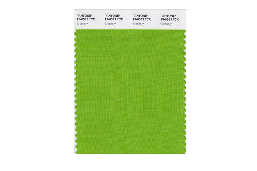
Pantone goes very green with hopeful Color of the Year
Loading...
The “global color authority” has chosen: 2017’s Color of the Year is “greenery.”
On Thursday, the Pantone Color Institute announced that next year’s most important hue will be Pantone 15-0343, a “yellow-green shade that evokes the first days of spring.” The choice, settled somewhere between prediction and hope, seems a response to the current climate of political and social division.
“This is the color of hopefulness, and of our connection to nature,” Leatrice Eiseman, the vice president of the institute, told The New York Times. “It speaks to what we call the ‘re’ words: regenerate, refresh, revitalize, renew. Every spring we enter a new cycle and new shoots come from the ground. It is something life affirming to look forward to.”
As the Times’ Vanessa Friedman wrote:
In other words, if 2016 was your annus horribilis, as 1992 was for Queen Elizabeth II, whether because of elections or market forces or because you were suckered by fake news on Facebook, this suggests the possibility of something different in 2017. It contains within it the promise that we can all start afresh, with a healthier attitude unfurling like a pea shoot and our feet firmly planted on the earth, as opposed to that isolated, alienating place known as cyberspace.
“Greenery” has been seen throughout history in times of great cultural change, from the social liberation of the 1920s to the psychedelic anti-war youth of the 1960s.
Pantone began choosing Colors of the Year in 2000, in an attempt to capture the zeitgeist in a single shade. Interestingly, Pantone doesn’t retroactively assign colors to match the mood of the previous year. Instead, the company looks forward, picking each year’s color ahead of time.
The colors aren’t used commercially – at least not by Pantone itself – but they have captured the public’s imagination as a means of cultural forecasting.
Last year, Pantone sought to convey a growing sense of fluidity in gender by choosing two colors: serenity (baby blue) and rose quartz (light pink). In 2015, it chose the reddish-brown marsala for comfort and security.
But there’s more to color than just symbolism. Some researchers believe certain shades can have profound effects on human psychology. Deep blues, according to some studies, may lead people to act more cautiously. In 2008, Japan tested that theory by installing blue street lights in an attempt to curb violence and suicides, The Seattle Times reported.
Color also plays a significant role in politics. But this has less to do with the red-blue party metaphor, and more with political intentions.
Red is often associated with power and passion. Hillary Clinton, perhaps sensing a need to fire up a Democratic base that was unenthusiastic about her candidacy, wore a striking red power suit to one 2016 presidential debate. Her running mate, Tim Kaine, was often seen sporting a red tie.
Blue, on the other hand, may suggest competence. Donald Trump, whose lack of political experience was regularly questioned, often wore blue ties throughout the campaign.
Retail stores play the color game too, painting their walls with cool colors to encourage purchasing. Of course, Tiffany & Co. built an entire brand on one shade of robin’s egg blue.
In May, Google changed its search results from blue to black links. Most users were unhappy with the brief change, but Google understands the potential value of color: In 2014, the search giant reportedly earned an additional $200 million just by changing the shade of blue it used in ads.
“We saw which shades of blue people liked the most, demonstrated by how much they clicked on them,’ Dan Cobley, Google UK’s managing director told The Guardian. “As a result we learned that a slightly purpler shade of blue was more conducive to clicking than a slightly greener shade of blue, and gee whizz, we made a decision.”
“But the implications of that for us, given the scale of our business, was that we made an extra $200m a year in ad revenue.”
This report contains material from the Associated Press.


