What is FriendFeed? And why it’s better than ever.
Loading...
The problem with social networking these days is that there is just too much of it. You can tweet on Twitter, post photos on Flickr, gossip on Facebook, or rant on your blog. It’s no joke that you could spend all day moving back and forth between these options.
That’s where FriendFeed comes in. FriendFeed is a social-networking aggregator – a one-stop shop for reading all the posts from your friends, family members, coworkers, former high school flames, etc. You can pull in content from more than 60 different services and websites.
FriendFeed has just renovated the site, making it a much more attractive destination for those who want to do all their social-media “shopping” in one place.
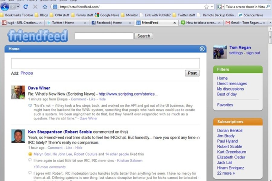
The first thing you’ll notice about the new FriendFeed is how much it looks like Twitter. Then again, Facebook’s recent redesign made it look a lot more like Twitter, too. I believe that all social networking will one day look and feel the same – the winners and losers will be decided by the special features that are unique to each site.
In the new FriendFeed, the left bar that held site navigation functions is gone, and has been replaced with a snappier version on the right side. The account, log out, and additional links are gone, too.
The result is much more pleasing to the eye. This FriendFeed looks more like a streamlined sports car than the dependable, four-door family sedan. And it proves that a keep-it-simple design can take a lot more time and engineering to get right, compared with a flashy or busy website.
The key new feature: real-time streaming of content. You no longer need to reload the page to get the latest on your friends. New info just pops up.
FriendFeed’s founders (all former members of the team that designed Google and Gmail) have said that they want to create a Gmail-like experience where people can send messages back and forth to each other quickly. This is both good and bad. Not having to hit the refresh button, like you do on Twitter, is nice. But if you’re a social-media maven with hundreds or even thousands of online friends, it’s like watching the numbers roll up on America’s debt clock. Things zoom by so quickly that you can get dizzy.
Fortunately, the FriendFeed folks have provided a solution for this problem: a pause button on the top right corner of the message window that allows you to take your time and read the posts until you’re ready to cruise back into the fast lane.
My favorite feature is the bookmarking tool that allows you to share any webpage on FriendFeed. Once you select the feature, a bookmark appears in the toolbar of your browser. When you see a story that you like, click on the icon in the toolbar and you’re sharing it.
Not everyone is crazy about all the new features. I, for one, am going to miss the old FriendFeed method of letting you know where messages came from. In the older version, a little icon would appear besides each post signaling that it came from Twitter, Digg, or Facebook. Now you get an image of the person who made the post.
But the biggest issue that FriendFeed needs to confront is “why do I need to use this service again?” As Caroline McCarthy wrote in a recent column on CNET, FriendFeed is still small potatoes in an already crowded field.
“FriendFeed is a niche service right now; what it really needs to do is break out of Silicon Valley and start gaining quasi-mainstream appeal the way Twitter has,” she wrote. “It’s not clear that this redesign will be enough to accomplish that.”
It’s true that I don’t tend to use FriendFeed as much as I use Twitter or Facebook right now. That’s because most of my friends are on the other services. So its handiness is somewhat limited at the moment for me.
But I’ve been encouraging friends to use the service because I don’t have time to go back and forth between social-networking sites all day. I’m just not that hip. I actually have work to do. That’s why I think that idea of “one-stop shopping” will ultimately push FriendFeed into the ranks of the top sites.
With social-media sites, it’s not about “location, location, location” but about convenience and ease of use.


