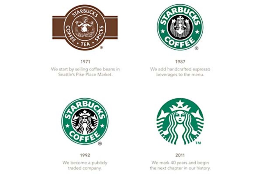
Starbucks logo change: No name. More mermaid. Will it sell more coffee?
Loading...
When you see a mermaid, do you think of coffee? Starbucks hopes so.
The Seattle-based coffee corporation announced Wednesday that they were changing their logo, stripping off all text – both the name "Starbucks" and "coffee," their signature product – and enlarging their stylized mermaid. Oh, excuse me, not mermaid, siren, as the company consistently calls it.
"Throughout the last four decades, the Siren has been there through it all. And now, we’ve given her a small but meaningful update," wrote Chairman and CEO Howard Schultz on the company's website. In the accompanying video, Mr. Schultz says, "It embraces and respects our heritage, and at the same time evolves us to a point where we feel it's more suitable for the future."
But does it actually evoke Starbucks?
"Is it a strong enough icon?" asks Laura Oswald, director of Marketing Semiotics, a marketing research company in Chicago. "Would you identify that mermaid as absolutely Starbucks the way you identify the golden arches as absolutely McDonald's?"
"A logo is almost like someone's face. If they change it, it’s almost like you don’t recognize the person anymore," says Dr. Oswald. So why would Starbucks take the step? "I have a feeling that they genuinely want to test the new logo, and at the same time, they want to get people talking," she says. Thanks to the Internet, "you can get feedback so quickly – it’s a way of doing market research."
She's not a fan of the new image – which puts her in plentiful company, as public opinion (as expressed in comments on Facebook and starbucks.com) are more than 10 to 1 against the change.
"I love Starbucks. But do you honestly think that if you have just the picture of the siren on your cup without the words Starbucks or Coffee that anyone seeing a cup around town somewhere will know where the heck it came from? Plus it is just boring," writes ivorygirl4ever at starbucks.com.
"We go to Starbucks for comfort, for that sense of familiarity, routine, of 'coming home.' You've taken too much of that away with the new logo," writes Jewel Goodwin on Starbucks' Facebook page. "It leaves a sour taste in my mouth more than any bitter latte ever can."
But not all response is negative.
"i like the logo! (i admittedly, i was a little worried when i heard about it...) thanks for keeping the same iconic green circle that I'm always glad to see! (and to those who think it needs to say Starbucks on it- i think you don't get it. Starbucks has such fantastic brand power people worldwide will know who it belongs immediately)" writes Narja Zarella Calvar on the Starbucks Facebook page.
"Love the new logo," writes Sara Emhoff Hauge, also on Facebook. "Streamlined, modern, simple, elegant. Change is obviously more difficult for some than others..."
The mixed reactions don't surprise the coffee giant. "We expected to see a variety of reactions to our new brand identity; they’re common in any re-branding project," says Starbucks.
Starbucks' logo has gone through two previous shifts, most dramatically in 1987, when Starbucks turned a brown woodcut into a green and black image. It dropped "tea" and "spices" from the text and changed the siren from a 16th-century Norse woodcut to a more stylized black-and-white graphic. "Starbucks became green," says Mr. Schultz.
But why a mermaid? Er, siren? The founders selected her to illustrate "the seafaring history of coffee and Seattle’s strong seaport roots," writes official blogger "Steve M.," in a lyrical tribute to the siren. "There was something about her – a seductive mystery mixed with a nautical theme." The original Norse woodcut showed a suggestive image of a two-tailed mermaid, evoking the seductive singers described in Homer's Odyssey. Since 1992, the increasingly simple graphic has downplayed the split tail, turning the twin fins into a simple decoration surrounding the central crowned female.
Exactly when and where will the new logo appear? The company didn't answer directly, saying only, "Customers will begin to see this evolution of our brand expression in Starbucks stores in March 2011," when Starbucks celebrates its 40th anniversary.
Several Internet comments echoed the backlash against the Gap logo rebranding, which the company withdrew within a week. Some have speculated that the whole point of the threatened Gap redesign was to stir up discussion and bring the floundering company new press. "Traditional advertising has become a lot less active," observes Oswald. "If you can get into a conversation on Facebook, that's where you want to be."
But she cautions against drawing too many comparisons to the Gap change. "Gap is in big trouble as a company. It has lost its luster.... They don’t seem to be managing the brand very well." For Starbucks, whose stock price has already rebounded from its recession lows, "As far as I can tell, the brand is as strong as ever right now."
That might be why Starbucks decided to drop its name from the logo, Oswald suggests. It's a sign of strength for a company's logo to stand alone, without any text. "All you need to do is see the apple and you think of Apple computers. With the Nike icon, with time, they removed the 'Nike' and left the swoosh. The brand is so strong, it doesn’t need to have the name on the logo."
"The test really is: Is it a strong enough icon that people will recognize it as a Starbucks icon and not just a random mermaid?" Oswald asks. "Have they gotten there yet?"


