Books by design
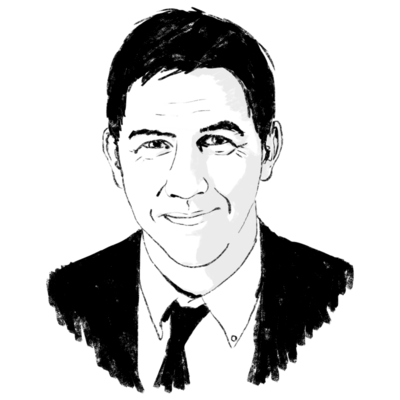
''A lot of people look at a book and they don't even realize that anyone has spent time designing it.'' Bruce Campbell, who operates his own design studio in Hopewell, N.J., is not vexed by this inattention to the visual achievements of his profession. Quite the contrary. It's a fact of life that pleases him.
About a fifth of his working time goes to one of the major book projects under way in this country: the Library of America. Campbell has been overall designer for the series from the start.
The library is an extremely ambitious undertaking that, after years of preparation, began publishing in 1982. It now has 16 titles available. It intends to produce a uniformly designed series of books that collect the writings of major American authors. The four volumes just coming out are representative of the program: ''Thomas Jefferson: Writings'' (edited by Merrill Peterson); ''Edgar Allan Poe: Poetry and Tales'' (edited by Patrick Quinn); ''Edgar Allan Poe: Essays and Reviews'' (editied by G. R. Thompson); and ''Stephen Crane: Prose and Poetry'' (edited by J. C. Levenson). Each is a big, handsome volume, somewhat on the pricey side ($27.50 apiece); but each is a testament to our literary heritage.
Educated in advertising design at Syracuse University and graphic design at Indiana University, Campbell got his first job designing books at Princeton University Press. But he also free-lanced, an activity that took increasing amounts of his time. ''It was hard to hold down both,'' he says, so he elected to forsake the full-time press work for the free-lance life. Today he lives in a large old house in Hopewell (a village near Princeton, N.J.), a third of which serves as his studio. He has a secretary and one person who comes in to help out, but Campbell intentionally keeps his operation a small one. He likes the work, and he wants to do it himself.
''When I design a book, I first consider what the subject matter is and who the audience is. If the audience is a scholarly one, and the book is something to be read and studied, I concentrate on making the book easy to read. Readability comes from the sense of scale on a page, the size of type, the typeface. Naturally, some typefaces are much easier to read than others. There are thousands of typefaces available, but only about 100 are used over and over for the text, and 10 percent of those are used for 90 percent of the work.''
The book designer may also be in charge of selecting the paper stock a book is printed on, the cloth in which it is bound, the design of the binding itself. But all in all, a book design should not be obtrusive, says Campbell. ''You don't want to put your own personality into the design.''
When Campbell approaches a book, he starts with a two-page spread, just as though one were lying open before him. ''Is the text more important than the illustrations? If there are illustrations, are they going to go throughout the book or will they all be in one place? The main thing I want to do is to make a book beautiful - and readable, of course. You don't want every illustration in the book to appear in the same spot on this two-page spread. For example, if you have a small postage-stamp illustration on one page, you may not want a similarly sized illustration on the facing page. You don't design a single page; you're always dealing with what's facing it.
''Also, the design has to make sense throughout the book, starting from the half title page, the title page, and on into the book. There has to be a consistency. The chapter openings should have the same drop from the top of the page. The book should look as though one person designed it, not that several different design ideas were brought together in the book. If a book is easy on the eye, it's the designer who made it that way.''
The inescapable irony in Campbell's book design is that, as he says, ''good book design should be invisible.'' There are designers who create books of eccentric appearances, but this kind of self-imposition is not Campbell's reward.
''When it's finished, you have a tangible product before you,'' he says with an acknowledging smile of satisfaction. ''You made it the way it looks.'' And if a reader looks at it and doesn't perceive the hours of Campbell's handiwork that went into it, that's just fine with him.


