Politics aside, a visit to WhiteHouse.gov is a pleasurable visual experience: tasteful colors and layout, American flags and encouragement to learn more. President Obama’s personal website (barackobama.com) succeeds as well.
“[President Obama and his web designers] knew exactly what to do to get results,” Shaoolian recalls. “What kind of personal touch to give the site.”
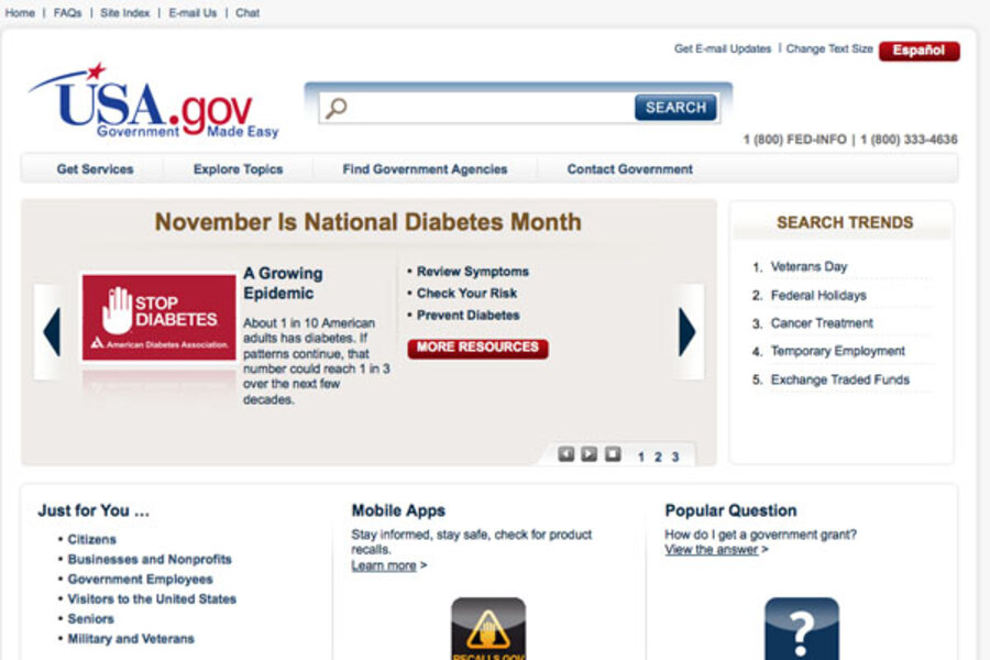
Type “US Government” into any search engine however, and USA.gov pops up on top. The self-proclaimed “Government Made Easy” web portal is anything but that. It’s impersonal and hard to follow – not what citizens usually want from their representatives, virtual or in-person.
“It’s so uninviting that it’s not functional,” says Shaoolian.
Other government websites, such as the US Census Bureau – census.gov – appear no better.
What is more important on a website, looks or functionality?
“They go hand in hand,” the expert explains. “Again, take Apple. Everything Apple does is groundbreaking, not necessarily because of their technology, but because of the interface, the ease of use, finding what you want in as few clicks as possible.”
As for the government’s web portal, a few images of smiling Americans could go a long way in reducing its stark, corporate current look.

usa.gov
USA.gov seems to have learned nothing from President Obama's effective websites.


