Confused by pandemic data? Here’s some help reading it.

|
CareSouth Medical and Dental/AP
A member of the medical staff at CareSouth Medical and Dental fills out paperwork for a vaccine patient in Baton Rouge, La.

With the rollout of vaccines, we have entered a more hopeful phase in the fight against COVID-19. But how does one make sense of the labyrinth of 14-day averages, hospitalization rates, positivity percentages, and caseloads?

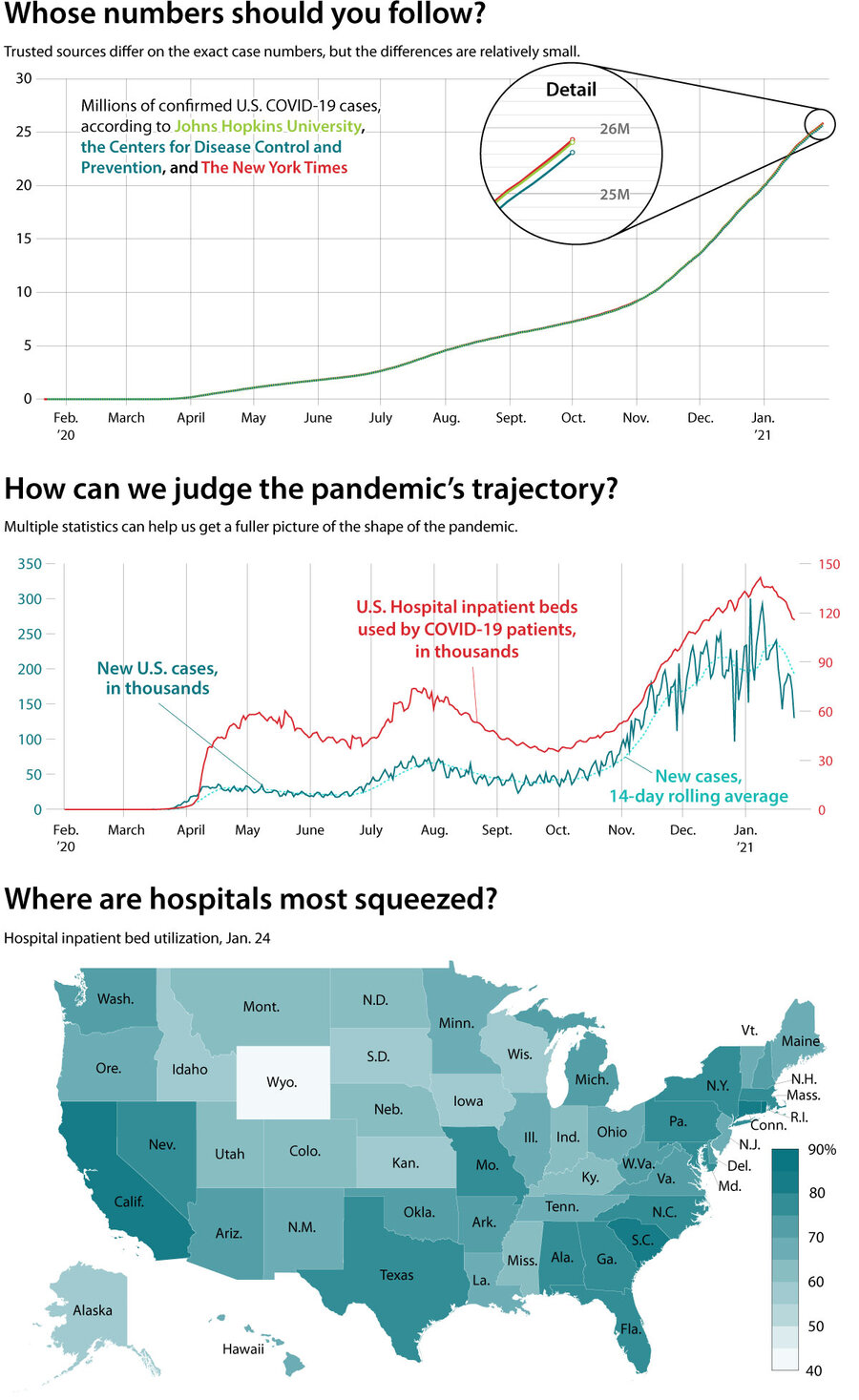
Step one is picking a reliable data source and following it throughout the pandemic.

“You need to know that [the data is] going to consistently give you the same kinds of information throughout the pandemic so that you make the right decisions when you need to,” says Lauren Ancel Meyers, professor of integrative biology at the University of Texas at Austin.

Why We Wrote This

There’s no shortage of data on the pandemic, so it’s difficult to know what to look at to understand how populations are faring. For the best picture, it pays to watch a few key indicators.

Though their numbers often vary slightly due to marginally different methodologies, The New York Times, Johns Hopkins University, and other data sources report consistent findings.

But even with a trusted data source, individual indicators of the pandemic’s severity can be difficult to parse. Case data, for example, always involves some amount of selection bias since the number of positive cases depends on the number of tests administered.

For that reason, people should approach the data as a “larger ecosystem,” says John Quackenbush, chair of biostatistics at the Harvard T.H. Chan School of Public Health.

Within that ecosystem, the fatality rate illustrates the severity of an outbreak. But since there’s usually a weekslong lag between infection and fatality, it’s also one of the least useful indicators in real time.

Hence the need for case counts and hospitalization rates, which speak more to the present. Although the number of cases in an area says little about how many people are experiencing symptoms, the trend in those cases shows whether the coronavirus is becoming more or less abundant.

In turn, hospitalization rates indicate the toll that virus is taking on the community. As a subset of that data, the number of intensive care admissions underscores the strain that an outbreak is placing on medical capacity.

Taken together each data set fills in gaps left by another, providing a fuller picture of how well a public health system is managing the outbreak. Watching multiple statistics at once allows a more holistic risk assessment.

SOURCE:

SOURCES: Johns Hopkins University, Centers for Disease Control and Prevention, New York Times, and Department of Health and Human Services

|
Jacob Turcotte/Staff
You've read  of  free articles. Subscribe to continue.
Real news can be honest, hopeful, credible, constructive.
What is the Monitor difference? Tackling the tough headlines – with humanity. Listening to sources – with respect. Seeing the story that others are missing by reporting what so often gets overlooked: the values that connect us. That’s Monitor reporting – news that changes how you see the world.

Dear Reader,

About a year ago, I happened upon this statement about the Monitor in the Harvard Business Review – under the charming heading of “do things that don’t interest you”:

“Many things that end up” being meaningful, writes social scientist Joseph Grenny, “have come from conference workshops, articles, or online videos that began as a chore and ended with an insight. My work in Kenya, for example, was heavily influenced by a Christian Science Monitor article I had forced myself to read 10 years earlier. Sometimes, we call things ‘boring’ simply because they lie outside the box we are currently in.”

If you were to come up with a punchline to a joke about the Monitor, that would probably be it. We’re seen as being global, fair, insightful, and perhaps a bit too earnest. We’re the bran muffin of journalism.

But you know what? We change lives. And I’m going to argue that we change lives precisely because we force open that too-small box that most human beings think they live in.

The Monitor is a peculiar little publication that’s hard for the world to figure out. We’re run by a church, but we’re not only for church members and we’re not about converting people. We’re known as being fair even as the world becomes as polarized as at any time since the newspaper’s founding in 1908.

We have a mission beyond circulation, we want to bridge divides. We’re about kicking down the door of thought everywhere and saying, “You are bigger and more capable than you realize. And we can prove it.”

If you’re looking for bran muffin journalism, you can subscribe to the Monitor for $15. You’ll get the Monitor Weekly magazine, the Monitor Daily email, and unlimited access to CSMonitor.com.

QR Code to Confused by pandemic data? Here’s some help reading it.
Read this article in
https://www.csmonitor.com/Science/2021/0201/Confused-by-pandemic-data-Here-s-some-help-reading-it
QR Code to Subscription page
Start your subscription today
https://www.csmonitor.com/subscribe