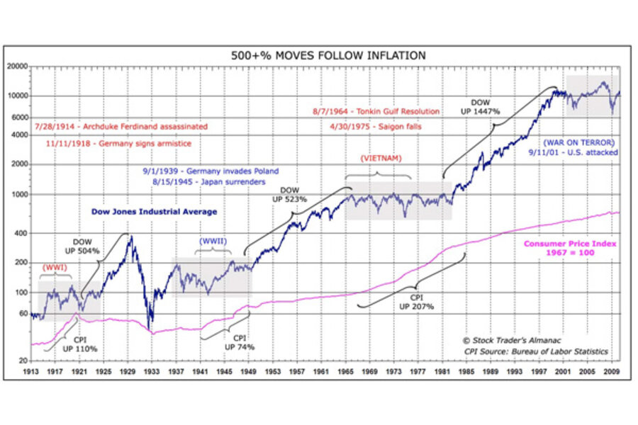
My favorite chart on Earth
Loading...
You know you're a stock market obsessive if you walk around all week with the hard copy Stock Trader's Almanac in your bag.
Notice where the apostrophe is in that title. Singular possessive - it's not a traders' almanac (as in for everybody), it's mine - yours if you have a copy. An indispensable book. Anyway, on page 36 is my favorite chart on earth. There are other charts like it but this one is mine, one chart to rule them all, etc. I was flipping through the book this morning on my train ride and came across it again, you have probably seen it before also.
This chart instantly puts my whole career and world in perspective whenever I see it...
As someone who began his career at the tail end of an 18 year bull cycle it keeps me hanging on.
As someone from a generation that has yet to see a true expansion of our own, it encourages me to keep building.
What we're doing now with monetary and fiscal policy is inflationary.
The world adding 75 million new mouths to feed is inflationary.
A billion people all attempting to become mobile phone-toting, SUV-driving middle classers is inflationary.
Fighting two wars (that are finally winding down) is inflationary.
But the aftermath of a wartime, big government-spending era is inflation, and inflation - when kept in check - leads to this. 500% return genuine bull markets.
I'm willing to wait and fight through to get to mine. Come tomorrow or a decade from now.
Get your own Stock Trader's Almanac at Amazon:
Stock Trader's Almanac 2011 (Almanac Investor Series)
Read Also:
Next Super Boom — Dow 38,820 By 2025 (TBP)
Add/view comments on this post.
------------------------------
The Christian Science Monitor has assembled a diverse group of the best economy-related bloggers out there. Our guest bloggers are not employed or directed by the Monitor and the views expressed are the bloggers' own, as is responsibility for the content of their blogs. To contact us about a blogger, click here. To add or view a comment on a guest blog, please go to the blogger's own site by clicking on the link above.


