Hershey's new logo is sealed with a Kiss
Loading...
| Hershey, Pa.
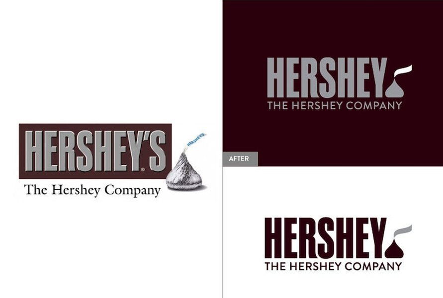
The Hershey Company is rolling out a new corporate logo that features a freshly stylized version of one of its most famous chocolate products.
The candy maker on Friday announced the new design, which adds a new version of the Kisses chocolate at the end of the company's name.
It's part of what the company calls a "disciplined identity system" designed to provide more consistency.
Ron Burrage, the company's senior global design director, says the goal is to help people "clearly identify, this is from The Hershey Company."
For its products, the only change will be on the back of packaging where the company's name is printed.
The Hershey Company's full press release announcing the logo redesign is below:
One hundred twenty years ago, people across America fell in love with the name “Hershey’s” stamped on a chocolate bar. Today, The Hershey Company– known for its iconic Hershey’s Milk Chocolate bars and more than 80 other confectionery brands around the world – is unveiling a refreshed corporate brand that builds on the company’s powerful legacy and creates a new, modern look and feel that positions the company for the next 100 years.
A key element of the broad corporate brand makeover is a fresh, new company logo. The logo redesign underscores the company’s evolution from a predominately U.S. chocolate maker to a global confection and snack company. The new branding will impact all visual aspects of howThe Hershey Company presents itself, from consumer communications to websites to the interior design of its office spaces and the look of its retail stores. While rooted in a rich heritage, the new corporate brand reflects a modern, approachable look that reflects the company’s openness and transparency as it has grown into a global company.
“Today we are much more than the ‘Great American Chocolate Bar,’” said Mike Wege, Senior Vice President and Chief Growth and Marketing Officer at Hershey. “We have an amazing portfolio of iconic brands in confectionery and snacking, a great workplace filled with remarkable people and a longstanding commitment to giving back to our communities. Our updated company brand and refreshed visual identity is an expression of our progression to a modern, innovative company that positively impacts our local communities as we continue to grow globally.”
The new corporate brand supports and reaffirms the purpose, values and culture that have been the foundation of Hershey since 1894. The Hershey Company’s brand promise – Bringing Goodness to the World – is a commitment that is deeply rooted in the company’s heritage and fundamental to the company’s current and future success. This promise is delivered by Hershey’s iconic brand portfolio, its remarkable people and the longstanding programs to help support children in need, a commitment that spans more than a century tracing back to when company founder Milton Hershey founded the Milton Hershey School for disadvantaged children in 1909. The company’s work helping kids in need continues, including support of cocoa-growing communities worldwide and innovative projects in Ghana that provide nutrition and education to malnourished children.
The new corporate logo - built upon the globally recognized HERSHEY logotype used on its famous Hershey’s chocolate bar - is a modern update that features a new interpretation of the iconic shape of its Kisses brand chocolate. Along with the new logo, Hershey is implementing a new, disciplined visual identity system that is inspired by the famous colors of its most iconic brands, including Hershey’s, Reese’s and Ice Breakers, to bring a more colorful and consistent look to all of the company’s visual materials.
From the beginning, Milton Hershey was focused on bringing goodness to the world through making chocolate affordable and accessible to everyone. He did this by building a progressive company committed to innovation, constant improvement and philanthropy. Now, more than a century later, the same values drive Hershey’s more than 13,000 employees around the globe who are operating in a complex and challenging market. The new corporate branding system and visual identity are emblematic of their shared purpose of bringing goodness to the world, and bridge time zones and cultures, honoring the company’s heritage while staying fresh and current in the marketplace.
Based in central Pennsylvania, The Hershey Company has about 13,000 employees and generates more than $7 billion in annual sales.


