Obama administration vs. ADP: Who do you believe?
Loading...
The administration has spoken with a singular voice on the state of the economy reassuring the public and suggesting that while our current economic hardships run deep, recovery is upon us and offering as its primary proof the nine month long expansion in private non-farm payrolls.
True enough, if you look at the trend in the Bureau of Labor Statistics (BLS) measure of private non-farm payrolls you get the sense of what the administration is publicizing, the decline in private jobs bottomed out at the end of 2009 and have been rising steadily ever since.
The gains since early 2010 have been steady and, while not strong enough to keep up with the inherent expansion in the civilian workforce, have brought the overall payrolls number back to showing annual gains with the latest reading rising 0.55% above the level seen last year.
For many though, these estimated results have appeared to be disconnected from the actual experience in the real economy where an improving job market hasn’t materialized.
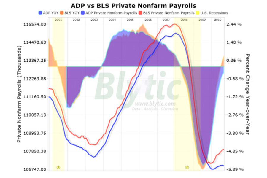
Comparing the private nonfarm payroll estimate from ADP, a national staffing and business services firm, to the BLS we are able to get a better understanding of what many outside of the administration are suggesting.
These two series paint starkly different pictures of the supposed “recovery”.
While the ADP series indicated a similar decline and bottoming period to that seen in the BLS estimate, the trends for both series since early 2010 have been very different.
The ADP series indicates and extremely weak recovery, so much so that it hardly looks like a recovery at all.
Worse yet, between August and September (the latest release), the ADP data showed the first month-to-month decline since the “recovery” began and overall is still making annual declines at the rate of 0.33%.
So who is right, the administration/BLS with their “V”-shaped “recovery” or ADP’s assessment showing an anemic and faltering economy?
Looking at the chart (click for full-screen dynamic version) you can see that these two series have never been this far out of whack.
Add/view comments on this post.
------------------------------
The Christian Science Monitor has assembled a diverse group of the best economy-related bloggers out there. Our guest bloggers are not employed or directed by the Monitor and the views expressed are the bloggers' own, as is responsibility for the content of their blogs. To contact us about a blogger, click here. To add or view a comment on a guest blog, please go to the blogger's own site by clicking on the link above.


